Showing posts with label Tips. Show all posts

Saturday, October 25, 2008

My approach to grade a landscape photo in Lightroon

Here, I am trying to share my typical work flow to deal with color grading landscape photos in Adobe Lightroom 2. (note: my photos is shot in RAW with Canon EOS 450D)


here is my photo. you can see its a overcast day with a lot of clouds and very little contrast.


I bootsted the exposure a little to bring up the sea.


I boosted the vibrance for richer colorful sea.


Now, using the gradient tool in LR 2, i lowered the exposure of the sky as well as boosted its contrast to see better details of clouds. I also turn up the saturation for richer color and even added the blue tint to enhance the blue.


Finally, i crop my photo for the panorama and also notice I try to crop with the rule-of-third in mind.


Some final tweaks boosting contrast and vibrance.

This is just some typical steps I do to most of my landscape photos but the acutual process will differ from photo to photo. I also spend more time to tweak individual color and split-toning ( and sharpening) to achieve the final look.


here's the comparison from start to the end.

Friday, October 26, 2007

Digital Color Grading

This video will show you how a color grading a photo can make the difference..
Most digital photo looks flat and saturated .. so I grade them to look more appealing and film-like.. You will notice why most of your average digital camera wont produce good results..
99% of the grading are done in Lightroom..
I made this as part of my demo reel.


Thursday, August 23, 2007

Seam Carving for Content-Aware Image Resizing

This new technology presented at siggraph 2007 is beyond COOL..
Many possibilities and uses.
See the video to believe.


Paper on this technique

Monday, August 20, 2007

EXIF Firefox extension

A few people asked me about what kind of camera I am using and the settings when I take the photos.
If you don't know it already, you can check EXIF information embedded in the JPG file to see the data.
Most of the digital camera saves out EXIF data in the jpeg file.. but sometime , that information is stripped out when trying to re-save in other programs.
Most of my photos have EXIF data intact. And there are many ways to view them.
Best way to view them in Firefox is to use this Firefox extension.
Just install the FF extension.. restart firefox.. and right-click on my photos ( in large views) .. choose properties from menu.. that's it.
Get it here

Usage

After installing FxIF, simply right click on an image, then click "Properties". The EXIF data will be displayed in the properties window.

The Firefox Context Menu contains a Properties item Invoking the properties item on an image displays the EXIF data

Saturday, August 18, 2007

Hunter Hunted

She took these photos of me.. when we're both sitting in my car on the way to supermarket..

I am really amazed by her composition and framing. I didn't tell her how to frame.


Only thing on this photo is the DOF is really shallow at f1.4. But I set it for her as its very dark. It's also at ISO 1000. You can see only one of my eye is in focus at this f stop. I'd have made similar mistake too.

This is taken inside supermarket. It a little out of focus. Cos I set my focusing mode to use middle point only. She just need to familiarize with the camera I guess.

So I am thinking of getting her a EOS 400D as a gift. Now we can share something both can enjoy.

Color Grading in Films

I always mentioned about how color grading in Hollywood films and commercials inspired me to do the grading in my photos. Here's is a little video that explain the process. It's not really new video. It's from making of the movie "king-Kong" from KongisKing website. It's done in Weta digital where I am currently working at. After watching that video, you'll have better idea on color grading work flow in films.
Click Here for the video (QuickTime required)

If you're interested more about film making and visual effects process behind the movie like King Kong, you can see more "production diaries" or "making-of" videos in KongisKing site. They are very informative and very interesting.

Friday, August 17, 2007

The Lenses and Me

I know all the photographers are more or less crazy about lens. And it's for good reason. I think they are probably the first thing you should invest. Camera body is important but without good lens, its useless. And you can keep the lens for many years but the camera body will keep changing esp in this digital day and age. So. I'm just gonna share about the lenses I have, how I use them and pros/ cons of them. Ok .. first of all , this post is not technical reviews about them. If you wanna know more about the sharpness and lens chart, you can find many information from the manufacturers site. And there's Fred Miranda's lens review site. A very good place to read lens reviews. But here, I will just talk about the pros and cons based on my use. Different photographers will have different needs and taste.
I'll start with my canon prime lens.

1. Canon EF 50mm f1.4 USM
This lens have many unique attributes. Its the speediest(brightest) , sharpest and lightest lens I have. And its the only prime lens I have. I use it on many subjects and its used to be my main lens of choice . Butnow I am using more Sigma 18-50mm f2.8 EX DC for its flexibility.
I had EF 50mm f/1.8 before I bought this lens. That lens was really good value for $$ but It's lacking in USM, 5 blades diaphragm (bad bokeh), cheap plastic construction. That's why I upgraded to this f1.4 version. And I think it's a good choice.

Things I like about this lens;
  • Fast f1.4 aperture allow me to shoot in any possible low light situation.
  • Fast and quiet USM focusing.
  • Super smooth Bokeh and depth of field
  • Very light , Easy to travel with
  • Super sharp. Probably the sharpest non L lens.

Things I dont like about this lens;
  • minimun focusing distant could be closer
  • 50mm on crop body like EOS 30D is a little long. Not suitable for tight indoor portrait, landscape etc. That hinder me from using it exclusively as a normal lens. Currently thinking of trying EF 35mm f/2.0 or EF 28mm f/1.8 USM. 35mm f/2 is very reasonable price around US$200 so i think I'll give it a try. I enjoy the fixed focal length aspect of using prime lens. It forces me to be more creative on framing and composition.
Some of my favorite shots with this lens.


This one is shot at very very low light with ISO 1600

This shot is very tightly cropped. Hence look a little blurry.


I will continue on these lenses later.

2. Sigma 18-50mm f2.8 EX DC
3. Sigma 10-20mm f4-5.6 EX DC
4. Tamron 70-300mm f4-5.6 Macro LD Di

but I already wrote quite detailed review on Canon EFS 18-55mm f3.5-5.6 Kit lens here and here.


Tuesday, August 14, 2007

Lightroom Presets and Resources

I have developed many photos in Lightroom and i have already tweaked and saved many presets to get me started quickly. With these presets, I can develop a photo into a usable look quickly.. and I can try different look with just hovering over the presets in Develop module..
and then I just have to tweak exposure or some color/hue adjustment to get it done.. I think everyone should make them use them to speed up the processing.
so I am just sharing some lightroom sites and presets I found on the interweb..
The presets may not work out-of-the-box on your photos .. depending on your camera output and the style that you shoot. So it's best used when you adjusted them and customized for your need. But these will give you started quickly.
  1. Lightroom killer tips
  2. Lightroom Color Presets from Inside lightroom
  3. Lightroom Presets from lightroompresets.com
Enjoy..

Saturday, August 11, 2007

Lighting in Photography vs Computer Graphics

I am just trying to share some of the computer graphics pictures I have rendered in past a few years. I think by looking at them, you can see why photography is so closely related and why I am interested so much.


This picture is inspired by one of the Absolut Vodka advertisement. I called my vodka Absolut Barnyar ( Barnyar in Myanmar means Blah Blah). It was made more than 1 year ago in Maya and rendered with mental ray using dielectric materials. I was trying to achieve gradient frosted glass look on the bottle.. which I find is really expensive to render. This image took almost 30min to render on my laptop (Centrino 1.6 GHz)

For lighting, you can see I was using digital equivalent of soft boxes placed like that for reflection and soft shadows. Its rendered using final gathering in Mental ray to get color bleeding and such.
Same bottle from another angle and back drop. This image is still not finished. You can see the glass is almost black. The reason is I have not set full ray traced depth to get it transparent. Its expensive to render transparency in CG. That's why I am so happy to do so in Photography.

I did this about a year ago for CG talk lighting challenge entry. Lighting was done via 2 soft area light ( soft box) placed on left and right of the model. The reflection is from a HDR image.

This was done 3 years ago. Using a area light + HDR lighting too.

Lately, I haven't create anything CG at home. Working as a CG artist is enough for me. That's why I am doing more photography lately. I still like CG and creating photorealisitic images in it. But so far, I dont wanna fire up Maya or anything CG at home.

I think I will get tired in Photography if I have to do it for profession too. :P

Friday, August 10, 2007

Color grading , digital work flow and Lightroom

original
Processed in Lightroom, Added border in Photoshop

I think I'll share a little about my digital post processing work flow .
For me, taking photos is just a first step in it. The fun of processing the photos to me is as good as or even better than taking one. I enjoy playing with colors and grading them since I learn Photoshop back in 1996.
Colors can affect the mood of the image and its very important part of an image. If you pay attention to good TV commercials and Hollywood movies, you will notice how they play with colors to portray different mood. From bluesy muted colors of sad, lonely scary scenes to bright , vibrant and contrasty pictures of happy and joyful moments, the Hollywood has already mastered the use of color grading to alter the mood.
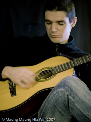
original
BW converted in Lightroom

For many high end film/ video post production, there's a process called grading and it went through a "Colorist" using expensive and highly sophisticated hardware/software to grade them.
Generally, people try to start with color correction, to get the right color balance, white point , black point , gamma etc. But they are not hard and fast rules for all cases. Its completely okay to bend them to get what you wanna portray in the picture. Back in the film days, using different film stock can yield different look . Also darkroom can take care of these tasks like dodging , burning .. even using cross processing.
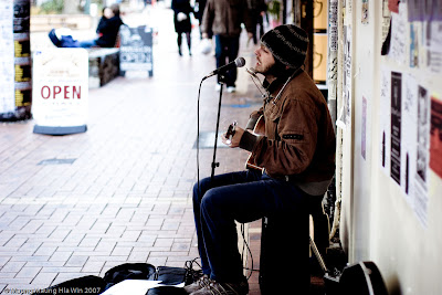
original
Cropped and processed in Lightroom

Now as we move on to digital photography, these tasks has moved into digital realm. And previously I used Photoshop to tweak colors and manipulate my images. But when I got back into photography after I got my first DSLR two months ago, I discovered Adobe Lightroom.

Adobe Lightroom is an amazing program. Its flexible , easy to use and non-destructive. I use it to process all my photos. I shoot all my photo in RAW mode ( think of them as digital negatives) and import them into LR to porcess them all the way I wanted.
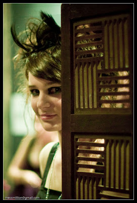
original
Cropped and processed in Lightroom

I usually start by adjusting the exposure, white point and black point. And then play with contrast and curve. This will get me a starting point for right exposure.
Then I am starting to playing with cropping to recompose. After that, I'll adjust white balance, hue and vignetting etc to make the image works..

You can see how these images has changed from original RAW image to final outputs. They usually look average to me when it came straight out of camera. Flat contrast, saturated tone etc. One thing to note is that I didn't use any mask or selection based color correction in my photos. All of these results are achieved with adjusting various sliders in Lightroom develop module. Lightroom color adjustment tools are pretty easy and great to use. But I'd like to see sliders to tweak color , hue and brightness in different zones ( like highlight or shadow) in next genereation of Lightroom.


But as color is a subjective matter just like music. So I dont dare to say I am doing the best decision for my photos. Different people like different taste. I am still learning this by posting my photos to Filckr, my blog here and different forums and getting their response.


So, feel free to let me know if these works for you or not.
I'll post more detail processing in Lightroom later..
Cheers..

Quiet

I haven't shot much interesting photos lately. Could be that its harder to find new subject? Could be the shitty week I am having at work? Could be that I am just running out of passion? I dont know.
On the other hand, my flicker gallery has now more than 4,000 views.. also my blog is slowly gaining momentum.. I feel bad that I haven't post a photo or blog post in a few days.. So today I try to find something to shoot.

Here it is.. not a very interesting subject.. A product shoot of my phone .. I was just trying to replicate some of the lighting concepts I learn and used in computer graphics. Using white cards and black cards.

It was shot on a black cloth draped over my chair. The white reflection is the A4 paper I held in my hand above the phone. It was lit by Canon 430ex speedlite firing into it.
Lighting info, Canon 580ex II on camera right 1' above the subject shooting into an A4 envelope on the left. and 430ex further away from camera right shooting in the A4 paper held above by my hand. lighting ratio 2:1 ( 580ex : 430ex) triggered by ST-E2.
my phone was a litle dusty so i did some dust busting in Photoshop afterwards.

This is another closeup shot of my laptop logo in the similar setup.. I was thinking of shooting the whole laptop but the chair was not big enough and I was lazy to move the whole setup to my table. May be tomorrow.

Monday, August 6, 2007

580ex , 430ex, ST-E2 and outdoor shoot

As I mentioned in my previous post, I really wanted to know how 580ex , ST-E2 and infra-red ETTL will work in daylight situation. And I also wanna learn how lighting ratio will help me get nice photos. Lucky me.. Today, my colleague Matt lend me a 580ex to play with and I am a one happy cat.

I just couldnt wait but asked my friend and colleague Pete to pose for me.. We just headed to the car park at the back of the office. I setup my camera in Aperture priority mode. Set my 430ex in Gropu B , ETTL mode. Set 580ex in Group A, ETTL mode too. And then set my ST-E2 to use Lighting ratio 2:1 (more on Group A, 580ex). Lastly, I set my camera exposure compensation to -2 stop to get underexposed background effect like you seen in the pics..


That's it for the settings.. then I placed 580ex on a platfrom 1' above the ground on camera right.. and holding 430ex on my left hand stretched as far as I can ...
Shooting is easy.. all done in less than 15 minute.. no hassle of adjusting flash outputs and apreture to get proper flash exposure.. All handled by ETTL.. and I still have control by using flash exposure compensation and lighting ratio on ST-E2. So.. I am really pleased.. And they worked so well that it even looks like they are photoshopped inside on a blue screen background. It will be better with proper light stand and umbrellas may be..
Except out of 10 or so shots, flash didn't fire on 3. that mean 70% working.. It could be that both flashed are almost 180' on the side and lost line of sight on that occasion. I think it can be avoided with proper placement of flashes.


even though the flash didn't fire.. the silhouette turned out interesting.

Man.. now I am itchy for 580ex.
Thanks to Pete and Matt for making this shoot possible..

Saturday, August 4, 2007

Different Flash Diffuser tests for Low Key lighting

I was quite disappointed that I couldn't achieve proper low key lighting with my current setup so I did this little test to figure out how each diffuser is affecting the light quality.

I use all the diffuser I have. omnibounce , inflatable softbox ( about 8" x 6") and lumiquest bouncer.
I also shoot with manual mode without adjusting the aperture to see the light loss from different diffusing method. As usual, I had no choice but to use myself as a guinea pig.
They are all shot inside my room so there's constraints about the camera:flash:subject ratio to control the light diffusing into the back wall. I put myself as far as I can from the wall to minimize the light falling into the background and put the flash as close as I can to me too.

All photos are shot with EOS 30D, Sigma 18-50mm f2.8 EX DC lens at f3.5, 1/180s ISO 200 , focal length 46mm.
Camera is 3' away from subject. White wall behind me 2.5' away. 430ex flash on 1/64 power beside me right 1.3' away.
pardon the focusing.. cos i m too lazy to use remote.

first, unprocessed version .. you can see the light loss from different diffuser by looking at the brightness.

now the lightroom processed version to compensate the exposure / levels..


In my opinion , the inflatable softbox is most useful as it has minimal light loss, less stray light casting on the wall and the soft quality of light on the subject.

Lumiquest bouncer + white trash bag give me the best soft box effect at the cost of light loss.

I think getting a silver umbrella and swivel is the ultimate solution for controlling that kinda lighting.

Anyway.. after that test.. I wanna go try getting the shallow depth of field and low key lighting using strobes .. So I made this self portrait.. Its really hard getting the focus on my eye and the right framing. Not the best composition but this is what I can get.

430ex on my right 1.5' away with inflatable softbox + a layer of white tshirt to even lower the output. flash at 1/64 power triggered with ST-E2.
50mm , f1.4 , 1/80s ISO 100.

cheers..